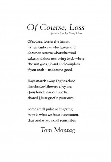
“Of Course, Loss” by Tom Montag

The Poet
Tom Montag is a middlewestern poet and essayist interested in the relationship between people and place. His poetry includes In This Place: Selected Poems 1982-2013, The Big Book of Ben Zen, and Middle Ground. His prose includes Curlew: Home, a memoir of growing up on an Iowa farm, and The Idea of the Local, essays exploring the relationship of people and place. Montag serves as managing editor of the Niedecker Monograph Series, What Region?. He has been editor and publisher of a variety of small presses. He and his wife created The Wisconsin Poets Calendar in 1982. He was named a Founding Contributing Editor of The Pushcart Prize: Best of the Small Presses in 1976. His work is anthologized in The Long Journey Home: The Literature of Wisconsin through Four Centuries, edited by Jim Stephens. He has been married to Mary, his partner in everything, since 1969.
The Poem
For two full stanzas the poet composes a laundry list of disappointments catalogued in general enough terms for readers to insert their own distressing particulars. The poet is aware he might lose his reader, though, so he uses rhythm and sound (e.g., the repeated l’s in loss, lesson, leaves; the regular stresses of “STAND and comPLAIN,/ if you WISH—it DOES no GOOD”) to pull us through. And it’s a good thing, because the poem’s turn in the last stanza is toward the hope that we can, after all, understand something of each other. The poem’s “small pulse of…hope” is for our common humanity, a surprising end to a poem that, at least at first, holds tight to loss.
The Design
This poem reads like an old lesson, rediscovered; Luminari resembles the careful penmanship of a monk whose life’s work was to copy text worth teaching. To keep the page from looking too antique, the remaining text needed a typeface that had a similarly regular curve but with a more contemporary feel. Goudy Old Style has slightly upturned serifs similar to Luminari’s but a more open letterform that balances the dense look of the poem’s body.
