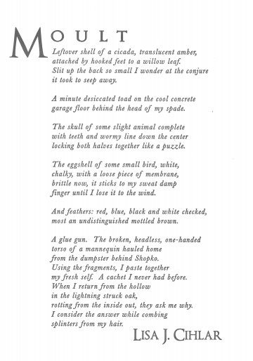
“Moult” by Lisa J. Cihlar

The Poet
Lisa J. Cihlar’s poems have appeared or are forthcoming in The South Dakota Review, Green Mountains Review, The Prose-Poem Project, In Posse Review, and Blackbird. She is the author of two chapbooks, The Insomniac’s House (Dancing Girl Press, 2011) and This is How She Fails (Crisis Chronicles Press, 2012). She lives in rural southern Wisconsin.
The Poem
Poets love lists so much that it can be hard to make a truly fresh one, but Lisa Cihlar has managed it. First, she pulls us in with a vivid inventory of organic detritus. Her speaker is fascinated with the kind of remains that quickly disintegrate or blow away; she lingers on beauty and grossness, the remarkable and the mundane in equal measure. And then there is the glue gun. Just as the speaker uses it to create a new self, the poet uses it to transform the poem. What was previously cast aside gets incorporated into a new whole: “my fresh self. A cachet I never had before.” But selfhood is never that simple, never only cobbled together bits – it also emerges, sui generis, in this case from “the hollow/ in the lightning struck oak,” shedding splinters for someone else to find. It’s a beautiful way to describe what it means to be human.
The Design
This poem meditates on transformation, more specifically on the remnants left behind and the hint they give about the shape of what continues. To amplify that movement inherent to the process, an italic was necessary, preferably in a classic typeface to reflect the durability of this type of struggle. Baskerville is just such a venerable face. The letters themselves squiggle and squirm; its italics allow plenty of white space around the letters, the suggestion of the space inside a husk. The typeface for the title and name needed to be similar but strongly anchored to balance the motion of so much italic. Optimus Princeps is similar to Baskerville in both its seraphs and its contrast between thick and thin strokes, but it remains distinct and achieves the desired effect.
