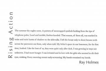
“Rising Action” by Ray Holmes

The Poet
Ray Holmes is a graduate of the MFA program at the University of Missouri—St. Louis. His poems have appeared in Fjords, Chariton Review, and Iron Horse.
The Poem
This poem is a treasure hunt. On the first read, all that’s apparent is disquiet. Something happened that summer, something important, but what? An initial survey of the territory reveals the outline of a regular summer full of girls, his father, chores, but after that, the reader must retrace their steps. It’s only on subsequent reads that the patterns begin to emerge, patterns of noise and silence, of nighttime darkness brought into the day by the eagles’ “noise and eerie bursts of shadow.” It gives an ominous cast to how the speaker is “growing” and “had more hunger.” But because this is a poem and not a story, there is no obligation for the poet to resolve anything. It is enough to make suggestions, to awaken memories of similar summers, when we knew the world had changed but we couldn’t immediately tell how. It is the essence of adolescence.
The Design
This poem borders on story and a classic book typeface like Baskerville serves to reinforce that association. The title is a direct reference to story structure and therefore needed a typeface that feels sturdy, something capable of supporting the weight of everything that follows. Optima has the necessary solid verticals but also wide open bowls that leave plenty of room for the imagination.
