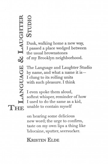
“The Language & Laughter Studio” by Kristen Elde

The Poet
Kristen Elde wrote for large-circulation health/fitness magazines for years before turning to short fiction and poetry. These days she focuses almost exclusively on poetry, with poems appearing online at The Nervous Breakdown. Her nonfiction work has run in magazines such as BUST, Health, Runner’s World, and The Writer. Kristen currently calls Brooklyn home, though her heart also splits time in Iceland and the Pacific Northwest.
The Poem
Did you “as a kid/ unable to contain [yourself],” revel in new words? Elde is inviting her reader to revisit that joy, to remember the words we loved for their sound before we knew their meaning. Consider how the repeated L and soft A sounds of “Language and Laughter” flow smoothly together, how the Bs and Ns repeat in “brownstones/ of my Brooklyn neighborhood.” To say it properly your tongue touches the roof of your mouth repeatedly, so it feels physically very different than the repeated vowels of “unable to contain” or “urge to confirm.” All of this is just a warmup, though, for the pleasure of saying and hearing yourself say a word like “seersucker.” Who cares that it’s a kind of fabric – those repeated Ss and Rs are like taffy on the tongue.
The Design
Didot is a contemporary of several other neoclassical typefaces all of which evoke the age of enlightenment. What could be better for a poem about the discovery of language? The reverse italic is an effect only possible with digitally generated type – it calls attention to those three words, emphasized like a traditional italic, but slightly odd because they are unfamiliar in the speaker’s mouth. The title of a poem is (among other things) its advertisement, it’s invitation to enter, similar to the sign on the storefront described in the poem. In this case, the length of the title provided an opportunity to shape it into a kind of marquee. Baskerville is a cousin of Didot, a fellow book typeface. Small caps helped fill out the mass of the “sign” arrangement.
