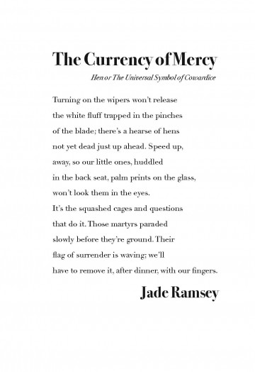
“The Currency of Mercy (Hen or…)” by Jade Ramsey

The Poet
Jade Ramsey holds an MFA from Bowling Green State University and teaches English and Creative Writing at Wakulla High School; she is the Poetry Editor of Gingerbread House and Faculty Editor of Wakulla Aeries Review. Author of Yawns Between Strangers (Finishing Line Press, 2014), her works are found in such journals as Gargoyle, Best New Poets 2013, Goblin Fruit, Whiskey Island, and many others.
The Poem
A successful image lingers and haunts. It hits you where you live. Think of the little girl’s red coat in Schindler’s List or the leg lamp from A Christmas Story (“It’s a major award!”). Both of these conjure a very specific, emotional response long after the movies themselves are past their cultural moments. Likewise the little piece of white fluff Jade Ramsey conjures here. It’s trapped like the hen it came from and signaling surrender—ostensibly an act of cowardice, but who’s really the coward here? The hen who gives up, knowing it’s beaten, or the parents who speed away to avoid their children’s awkward questions about the origin of their dinner? Perhaps all of us, chewing away at our own dinners while ignoring the (bloody) origins of our food. It’s a clever turn. Now whenever you see a little bit of white bird fluff—chicken or no—you’ll also think about those hens in their hearse.
The Design
Not technically a sonnet, this poem adheres to the spirit of the form if not the letter of its law. So it calls for a typeface that’s both classic and a little fancy, like Didot: good legibility but with a little more flourish to its ascenders and descenders, especially the tiny balls of ink at the bottom of the lower case y and j, hanging there like chicken fluff. Anything more overtly avian would’ve drawn too much attention away from the poem’s true subject: the couple in the car. Bodoni’s level of contrast between thick and thin strokes is similar to Didot’s and gives the page a balanced, classic look.
