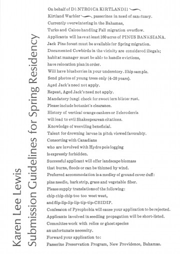
“Submission Guidelines for Spring Residency” by Karen Lee Lewis
The Poet
Karen Lee Lewis is an independent Teaching Artist, and a Teacher Consultant for the Western New York Writing Project. She teaches creative writing for non-profit organizations and art galleries throughout Western New York. Her “Picturing Poetry Project” with Amy Luraschi, was the subject of a documentary film by Jon Hand, and was aired on PBS. Karen is a fellow of Canada’s Banff Centre’s Wired Writing Studio. Her poetry, short fiction, features, and photography have been widely published, recently in Red River Review, Nomad, Stormy Weather, the Nature Conservancy’s newsletter Nature, Buffalo Spree and Teachers & Writers magazine. Karen won Honorable Mention in the 2010 Aurora Artisan’s Wordsworth poetry contest. Her poetry was nominated for a Pushcart Prize by Slipstream Press. Editorial work for Traffic East magazine is archived at trafficeast.com. Her full-length poetry collection, What I Would Not Unravel (Writers Den Books), is available at Amazon and Barnes & Noble.
The Poem
Writers and artists will smile at how this poem inserts the lexicon of bird habitat conservation into the standard call for residency applications. That kind of cross-pollination is something that poetry does well, as is the list format. But the poem’s appeal is much more broad; anyone who has ever searched for an apartment or a job will empathize with the task ahead of the Kirtland Warbler – there is always so much to consider, so many hoops to jump through! Lewis is obviously enjoying poking fun at overly prescriptive submission guidelines, what with her threat of “evil Shakespearean citations” and request for translations of bird song. But the poet is also quite serious, placing at the end, where it will be what’s best remembered, a reminder that the consequence of failure is death. Not just of the individual, but of the entire species. It’s strong medicine disguised in a huge, humorous spoonful of sugar.
The Design
Astute readers will note this poem has 35 (!) lines, which presents a design challenge for a page that is only 5 1/2 x 8. Luckily the poem is patterned after classified ads that often appear in writer’s magazines. What could be more appropriate than a small typeface? Read the fine print and discover the deep seriousness of “ghost species” inside the joyous “blueberries in your understory.”