“Seizure” by Corey Mesler
The Poet
Corey Mesler has published in numerous journals and anthologies. He has published four novels, Talk: A Novel in Dialogue (2002), We Are Billion-Year-Old Carbon (2006), The Ballad of the Two Tom Mores (2010) and Following Richard Brautigan (2010), two full length poetry collections, Some Identity Problems (2008) and Before the Great Troubling (2011), and two books of short stories, Listen: 29 Short Conversations (2009) and Notes toward the Story and Other Stories (2011). He has also published a dozen chapbooks of both poetry and prose. He has been nominated for the Pushcart Prize numerous times, and two of his poems have been chosen for Garrison Keillor’s Writer’s Almanac. He also claims to have written, “Coronet Blue.” With his wife, he runs Burke’s Book Store in Memphis TN, one of the country’s oldest (1875) and best independent bookstores. He can be found at coreymesler.com.
The Poem
How do you describe the failure of language using language? It’s a challenge well suited to the compressed space of poetry. We’re never told who Chloe is, but it’s easy to tell she’s loved – loved so much, in fact, that her seizure incapacitates the speaker as well. So much is left unsaid. The reader is allowed to fill in those enormous blank spaces with emotion, with whatever associations the poem’s images provoke. “Now it’s years ago,” and this is the first time s/he has been able to speak of it. Language has failed in the way that language always fails in the face of fear. But language also returns to give us the poem, the outline of the unspeakable.
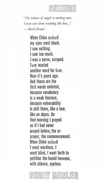
The Design
The title typeface was easy to choose; Gothic Outline suggests the emptiness that lurks inside helplessness and fear, the sense that a seizure renders its victim a shell. For the epigraph, an italic was in order to suggest the motion of many bees; VanDijck is a timeless mid-seventeenth century typeface and appropriate for a contemporary classic like Mark Strand. Alternate Gothic, used for the body of the poem, has thick letters with strong verticals which give the text a blocky feel, consistent with the speaker’s raw state of mind.