“On my persistent need to address others by full first name” by Meg Matich
The Poet
Meg Matich has been previously published in The Drunken Boat’s Bernadette Mayer Folio, and has work forthcoming in OVS Magazine. She is currently studying for her MFA in Writing –Poetry and Literary Translation at Columbia University in New York City, where she also interns at Litmus Press. She received her BA in English/ German from Saint Vincent College and is the founding editor of Typografika, a Munich-based literary magazine.
The Poem
The connection between name and identity is not a new mystery. A rose by any other name may smell as sweet, but could Marion Morrison have been just as tough as John Wayne? What’s at stake in this poem, though, isn’t an exchange of one identity for another; what’s different is the speaker’s fear of losing her identity entirely, that she slips further into anonymity with each shortening of her name. We tend to think of these short names as terms of endearment, but they can also function pejoratively, to diminish the person referenced. Neither is it universally true that using a person’s full name signifies anger, as Velentin assumes. So what’s our speaker to do but lead by example with “an incantation” to enjoy “the found phonetic beauty” of Valentin’s full name?
The Design
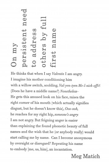
Perhaps it’s that the man in this poem has a Russian sounding name, or maybe it was the air of formality created by using full first names. Maybe it was the sonnet form… or maybe it was all of these things together that suggested a formal, classic book typeface. But there’s also an intimacy about the piece that required the face to have a bit of a romantic flourish. This is a job for Didot. The descender on the lower case y, even in the roman, has a slope and curl that could be a woman’s arm and hand, artfully tracing the back of a couch as she walks past. The curves of its bowls manage to be voluptuous, even when the letterforms stand perfectly straight. Century Schoolbook has a similar weight and so compliments Didot while the vertical arrangement of the title reflects how at odds the speaker is with her own, seemingly arbitrary need.