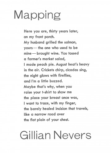
“Mapping” by Gillian Nevers
The Poet
Gillian Nevers started writing poetry in 2002 after retiring from a career working with victims of crime. Her poems have appeared in Silk Road, Miller’s Pond,Wisconsin People and Ideas,Pearl, Pirenes Fountain, Verse Wisconsin, the Wisconsin Poets’ Calendar, and several other print and online literary magazines. She was nominated for a Pushcart Prize in 2011 and won second prize in the 2008 Wisconsin Academy of Sciences, Arts and Letters statewide poetry contest. Gillian is the current membership chair for the Wisconsin Fellowship of Poets (WFOP) and writes the “Markets” column for the WFOP’s online, and print, Museletter. She has a degree in Art Education from the University of Wisconsin, Madison,with a concentration in printmaking and painting, which may explain why many of her poems are influenced by works of art. Gillian has two grown sons and lives in Madison, Wisconsin with her husband.
The Poem
This is a short poem with a big punch. The speaker is relaxed, enjoying the company of old friends on a lazy summer evening. But don’t let the tone fool you – Nevers lays out the loose tangle of this group’s history both to beguile and to prime her reader for the end’s intimate touch. That touch is the knot at the center of a complex history, but it’s also a kind of ‘you are here’ on the map of their shared lives. The “incision that travels,/ like a narrow road over/ the flat plain of your chest” will continue to connect these two women, just as their past includes the same man. This is something poetry does especially well: teasing out what’s True (in this case friendship) from the tangle of the everyday.
The Design
A no nonsense poem deserves a no nonsense typeface. Futura’s clean lines and sans serif style could be the curves and straightaways on a map drawn by your best friend to guide you to the cottage where they’re staying for the summer. The titles needed to make a similar suggestion, but on a grander scale; the lower case g of Light Gothic, with its flattened coil of a descender, could be a pair of cul-de-sacs. Likewise, the capital g resembles an arrow coming full circle “thirty years later.” Last, the title and the poet’s name aren’t aligned to the text because roads and journeys only align when you’re not looking.